HITT
Positioning a $2B contractor as an industry leader.
HITT Contracting needed a website that matched their reputation—building trust with clients and attracting 1,000 new employees in two years.
00

Qualified Leads
+228%
Lead Quality Score
+27%
Time-To-Contact
-42%
HITT's work was industry-leading. Their website wasn't.
HITT Contracting is one of the nation's largest general contractors. Building everything from hospital campuses to corporate headquarters. But their digital presence didn't reflect the scale, innovation, or craftsmanship they're known for. The site looked dated and failed to differentiate them in a competitive market. The challenge was twofold: attract high-value clients for complex projects AND recruit 1,000 employees over two years to meet growing demand. Most companies optimize for one audience. HITT needed a website that worked equally well for Fortune 500 decision-makers and prospective construction professionals. I led the complete redesign from stakeholder research through design system and execution. The result: 228% more qualified leads, 27% higher lead quality, and a recruiting tool that helped HITT compete for top talent.
01

Led research, strategy and design from discovery through launch.
I owned the creative direction and UX strategy for the entire project. The challenge was unique: B2B construction has long sales cycles and multiple stakeholders. Unlike e-commerce where you optimize for immediate conversion, here we needed to optimize for credibility, differentiation, and lead quality. We started with stakeholder interviews across HITT's business development team, recent clients, and HR leadership. This revealed what information matters when evaluating a contractor and what attracts top construction talent. I then designed information architecture around how both audiences think (by market sector and project type for clients, by career path and culture for recruits). Throughout execution, I collaborated closely with HITT's internal teams on content strategy, photography direction, and case study structure. The system needed to be sophisticated but maintainable so HITT's team could update it regularly without design support.
02

03

The design needed to feel authoritative, not trendy.
HITT's brand needed to feel authoritative and trustworthy, not trendy. I created a design system built on strong typography, structured layouts, and a restrained color palette that lets project photography and data tell the story. The system balances premium feel with the grit of construction work. Nothing is decorative, every element serves a purpose. Typography is confident and readable. Spacing is generous but structured. The result: a foundation that scales across markets, project types, and recruiting content while maintaining visual consistency and credibility.
04

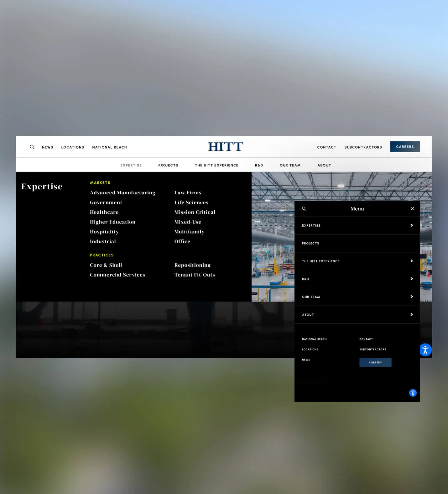
Organized around client decision making, not corporate structure.
The old navigation mirrored HITT's internal org chart: divisions, subsidiaries, corporate information. But that's not how clients or recruits think. Clients ask: "Do you build in my sector? Have you done projects like mine?" Job seekers ask: "What's the culture? Where can I grow?"
I restructured navigation around user needs: Markets (Healthcare, Higher Ed, Government, etc.), What We Do (capabilities that differentiate HITT), Projects (proof of expertise), and Careers (culture and opportunities). Visual previews in dropdown menus let users see relevant work before clicking through.
This structure works for both audiences. Clients find relevant experience quickly, recruits understand career paths, and both can navigate without understanding HITT's corporate structure.
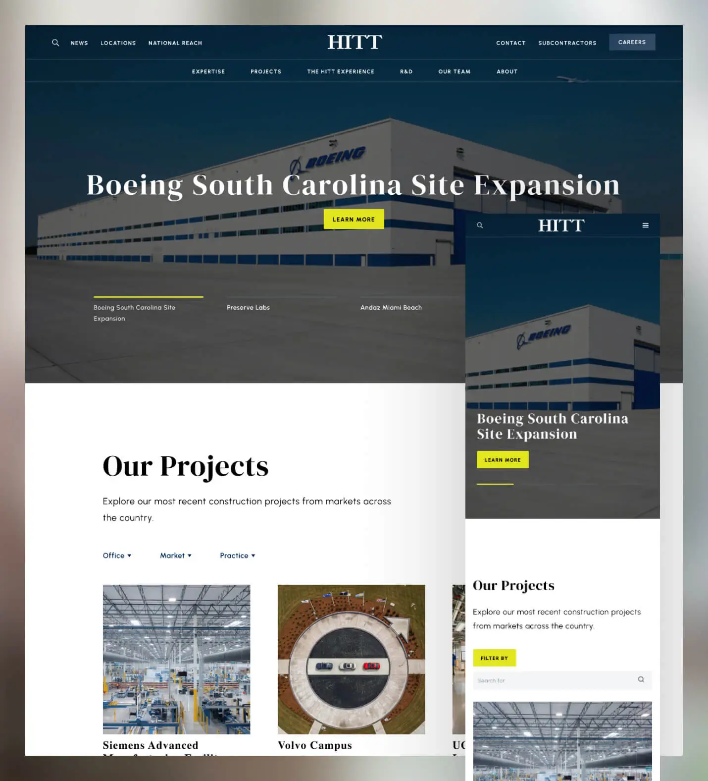
An opening that immediately differentiates HITT from every competitor.
Most construction websites open with generic hero images and corporate messaging. We needed something that immediately signaled "this company is different."
The homepage opens with a full-screen intro animation revealing HITT's team at work: scale, precision, and the people behind the projects. As you scroll, we layer proof points strategically: featured case studies showing complexity, statistics demonstrating scale, and testimonials building trust.
Every section speaks to both audiences. Project showcases appeal to clients evaluating capabilities. Culture content and career CTAs attract prospective employees. The experience feels premium but approachable, setting HITT apart in a sea of generic contractor websites.
In construction, pretty pictures don't tell the full story. Decision-makers need to understand: What was complex about this? What challenges did you solve? What scale can you handle? What was your specific role?
I redesigned project case studies to lead with compelling details: project value, square footage, timeline, unique challenges, and HITT's specific contribution. Each project page is structured as evidence of capability, not just visual showcase.
We also implemented horizontal scrolling for case study presentation. Unusual for construction sites, but effective for storytelling. This format lets us show progression, scale, and detail in a way that competitors' standard grid layouts can't match.
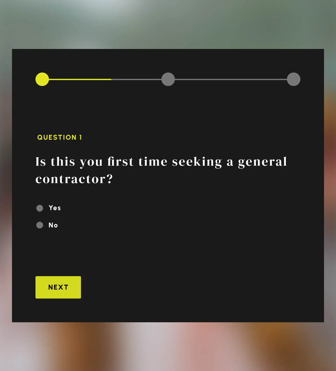
Pre-qualifying leads to focus on projects that match HITT's scale.
Not every project is a good fit for HITT. They excel at complex, large-scale work, not small renovations. The old contact form didn't filter, which meant the business development team spent time on inquiries that would never close.
I redesigned forms to pre-qualify prospects. Questions about project scope, timeline, and budget help identify serious opportunities before they reach the sales team. This increased lead quality by 27%. Fewer total leads came in, but conversion rate improved dramatically.
The approach respects both parties' time. Prospects get faster answers about fit, and HITT's team focuses on projects they can actually win.