Huelib
Building a Color Palette Platform from Concept to Launch
Huelib is a curated collection of color palettes drawn from the natural world
00

Tools Created
7
Curated Palettes
2000+
Vibe Coded
100%
Huelib is a color palette library and workflow platform I designed and built as a solo product.
Huelib combines curated nature-inspired palettes with a connected tool ecosystem. From palette generation, image extraction, real-context visualization, accessibility auditing, color blindness simulation, semantic token mapping, to developer-ready exports. The platform includes a freemium Pro tier with Stripe billing, a guides section for long-tail SEO content, and a complete internal linking architecture optimized for organic growth.
01

A tool wher finding a palette and validating it for real use happen in the same place.
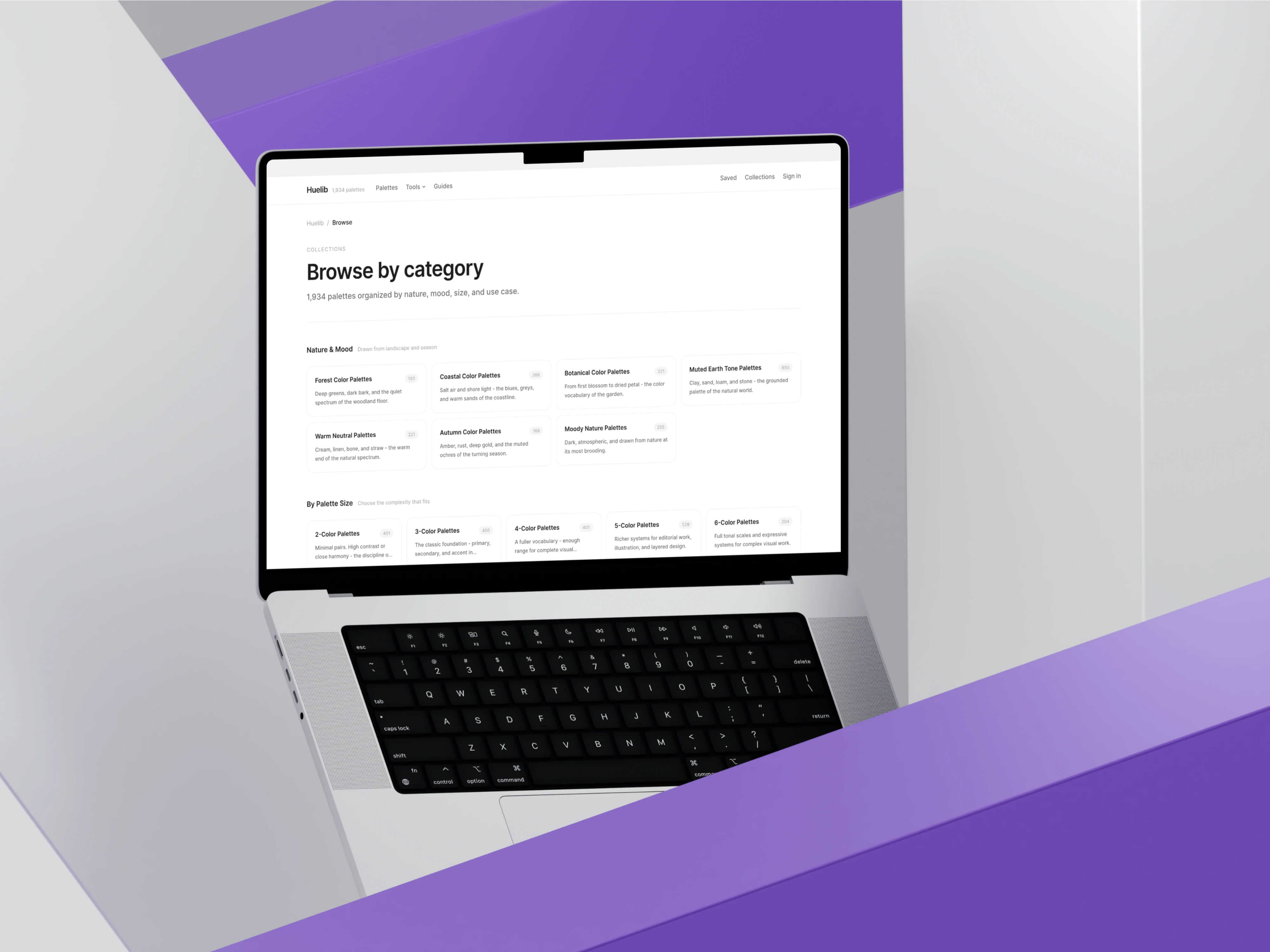
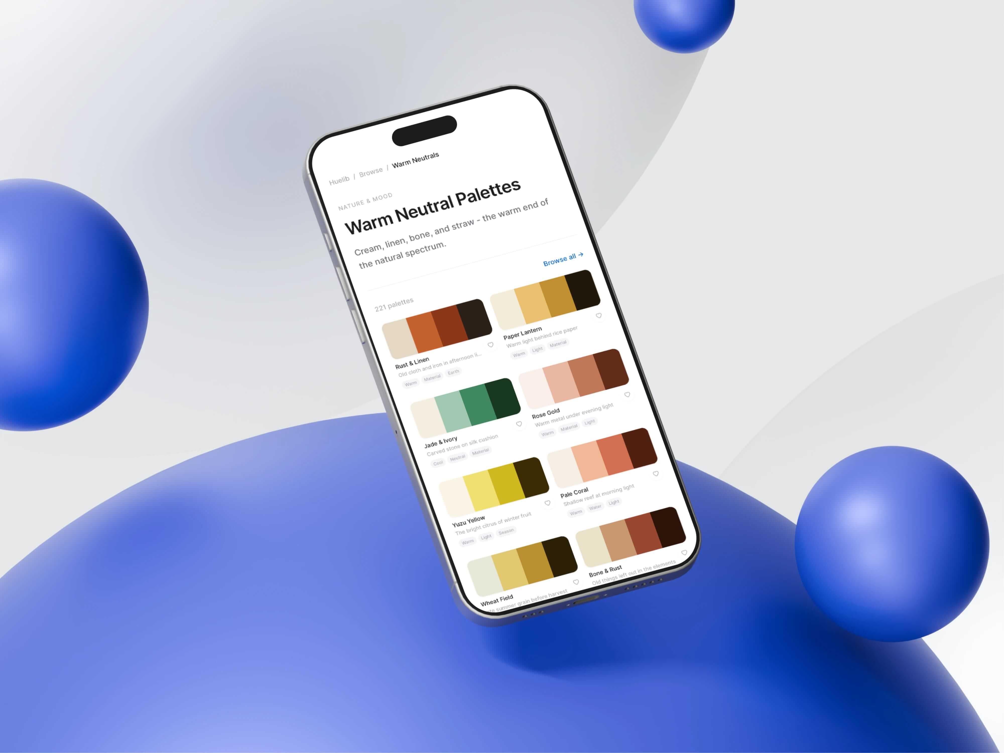
I structured the site around three interconnected pillars: discovery (palettes, categories, generator, image-to-palette), evaluation (visualizer, contrast checker, accessibility audit, color blindness simulator), and implementation (semantic token mapper, multi-format exports). Every page links meaningfully to related pages across all three pillars, creating a dense internal linking mesh that supports both user navigation and search engine crawlability. The IA includes 1,800+ palette detail pages, 25+ category landing pages, 7 tool pages, and 3 guide articles each with unique metadata, breadcrumbs, and contextual related-content modules.
02

03

The Palette Visualizer previews any palette on realistic design layouts.
Rather than showing palettes as inert swatch grids, it applies them to compositions with real hierarchy: navigation bars, cards, buttons, headlines, feature grids, and data blocks. The technical challenge was role assignment. A five-color palette doesn’t inherently know which color should be the background, which should be text, and which should be primary. I built an auto-mapping engine that analyzes luminance, saturation, and hue relationships to assign eight semantic roles: background, surface, primary, secondary, accent, text, muted, and border. Structural roles like surface, muted, and border are synthesized from palette relationships rather than mapped directly from input colors, producing more believable compositions.
04

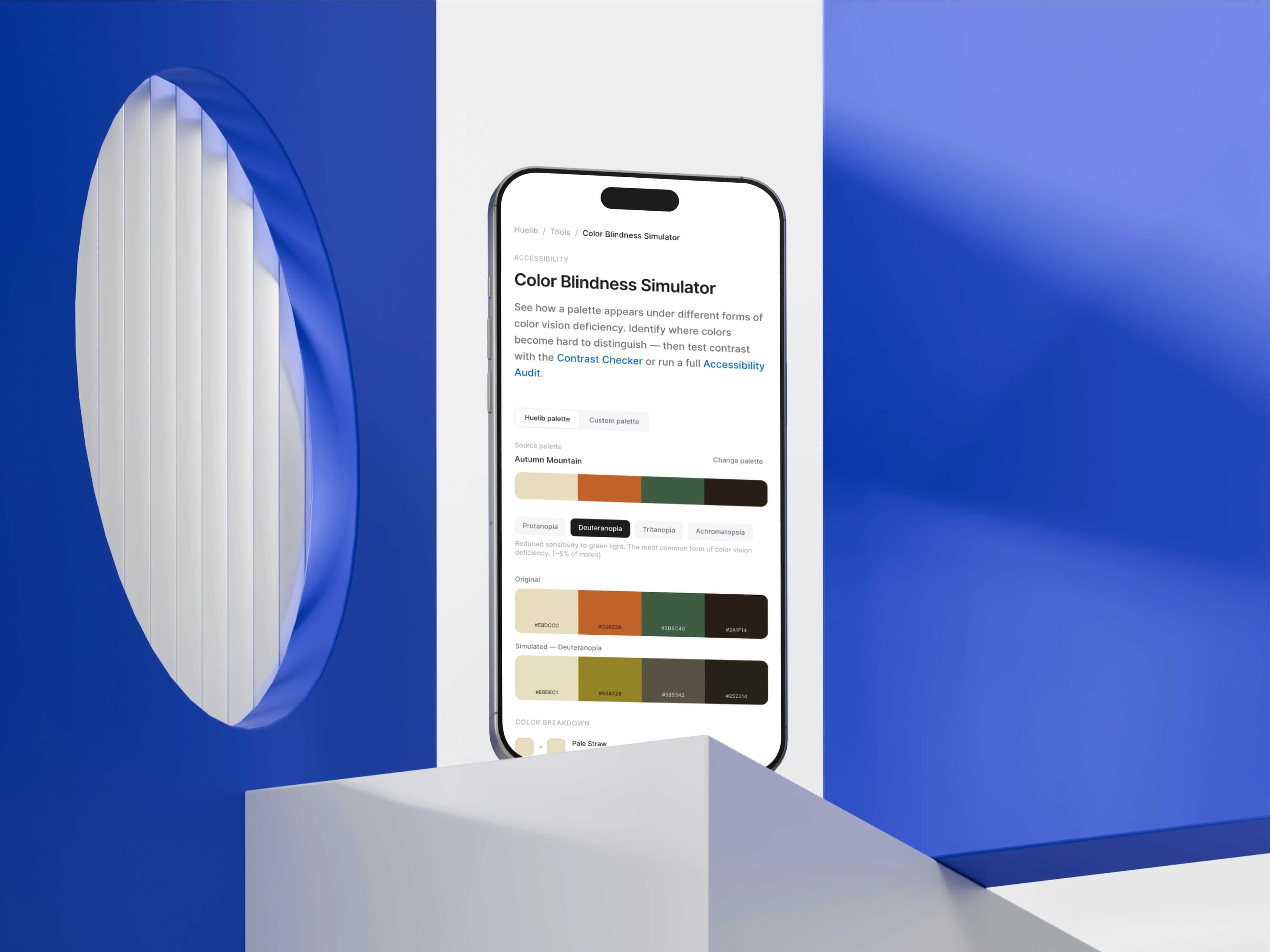
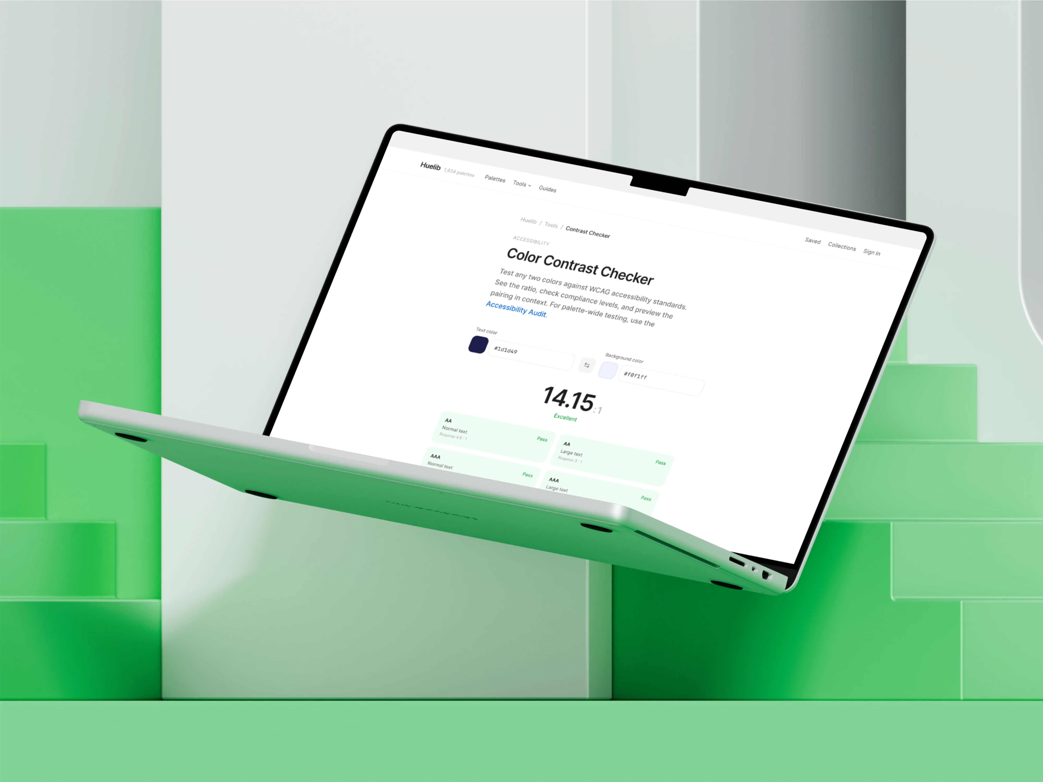
Rather than offering accessibility checking as a single utility, I built it as a three-tool cluster
A Contrast Checker for quick WCAG validation, a Palette Accessibility Audit that evaluates every color combination across an entire palette, and a Color Blindness Simulator that shows how palettes appear under protanopia, deuteranopia, tritanopia, and achromatopsia.
These tools cross-reference each other in their editorial content and related-tools modules. The contrast checker explains that it handles pairwise testing, then links to the audit for full-palette evaluation. The simulator explains that contrast measures readability while simulation measures distinguishability, then links to both. This creates a coherent “accessibility workflow” narrative rather than three disconnected utilities.
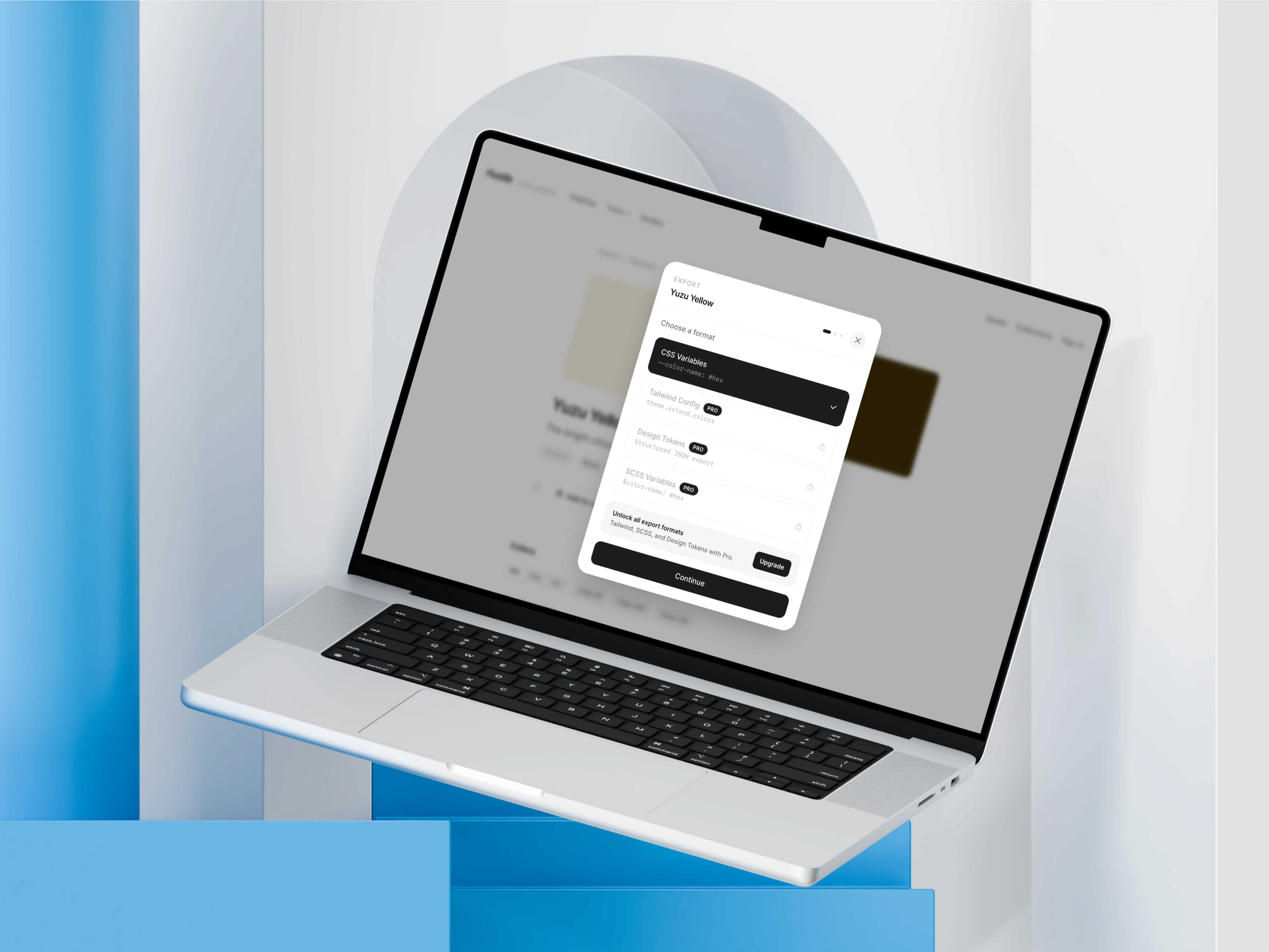
The freemium model gates features by professional utility rather than by arbitrary limits.
Free users get the full tool ecosystem, three visualizer scenes, and basic exports (CSS, hex). Pro unlocks three additional premium visualizer scenes, PNG/PDF export of visualizations, advanced export formats (Tailwind config, SCSS, JSON tokens), and unlimited collections. The Pro gates are surfaced naturally within workflow so users encounter upgrade prompts when they try to access a Pro scene or export, not through interruptive modals. Billing is handled through Stripe with webhook-based subscription management.
I approached SEO as product architecture, not content marketing.
Every tool page was built as a standalone landing page with search-intent-aligned metadata, editorial supporting content, and internal links to related tools, categories, and palettes. I created a shared ToolPageFooter component that renders contextually relevant related tools and category browse links on every tool page, ensuring consistent internal linking without manual maintenance.
The guides section (/guides) adds three practical workflow articles that target long-tail search queries: “How to check if your color palette is accessible,” “Choosing colors for UI design: a practical workflow,” and “How to extract a usable color palette from an image.” Each article links naturally into 10–13 relevant tool and category pages, creating crawl paths that connect educational content to product functionality.
Total internal link count across the seven tool pages went from an average of 2 links per page to 10+, with zero category links increasing to 5–6 per page.