Retrofete
Transforming a fast-growing fashion brand's mobile shopping experience
Retrofête needed an e-commerce experience that matched their premium brand while converting better on mobile.
00

Gross revenue growth
83%
Monthly average orders
85%
Organic traffic
Gold
Retrofête was growing fast, but their site was holding them back.
Accessing clean and pure drinking water is a significant concern in today's fast-paced world. Many individuals face challenges in finding a reliable source of high-quality water. Existing bottled water options often lack transparency in their sourcing methods, leaving consumers uncertain about the purity and origin of the water they consume. Furthermore, the inconvenience of purchasing and transporting heavy water bottles adds an additional burden to individuals seeking a consistent supply of clean drinking water.
01

Premium brand, functional site, but not built to scale.
My focus: the parts of the journey that influence performance most: discovery, narrowing, and product decision-making. We started with research. A large customer survey helped us understand what shoppers value and what makes them commit to a purchase. The survey surfaced two consistent friction points: difficulty finding the right size with confidence, and a mobile browsing experience that felt slow and cluttered under the weight of the photography. From there, I mapped user personas, information architecture, and shopping flows, then iterated through wireframes and prototypes in Figma until the journey felt clean and predictable.
02

03

Built a system that supports the photography, not compete with it.
Retrofête's photography is the brand. The UI needed to support it, not compete with it. I created a global design system with restrained, minimal treatments that keep focus on imagery while still feeling intentional and luxurious. The payoff: consistency across the entire site and a foundation that made future seasonal updates easier to execute without starting from scratch every time.
04

Treated mobile as the primary experience, not a compressed desktop.
We designed for mobile first. That influenced navigation behavior, spacing, tap targets, and how quickly a shopper can scan and take action. The goal was simple: browsing should feel effortless on a phone.
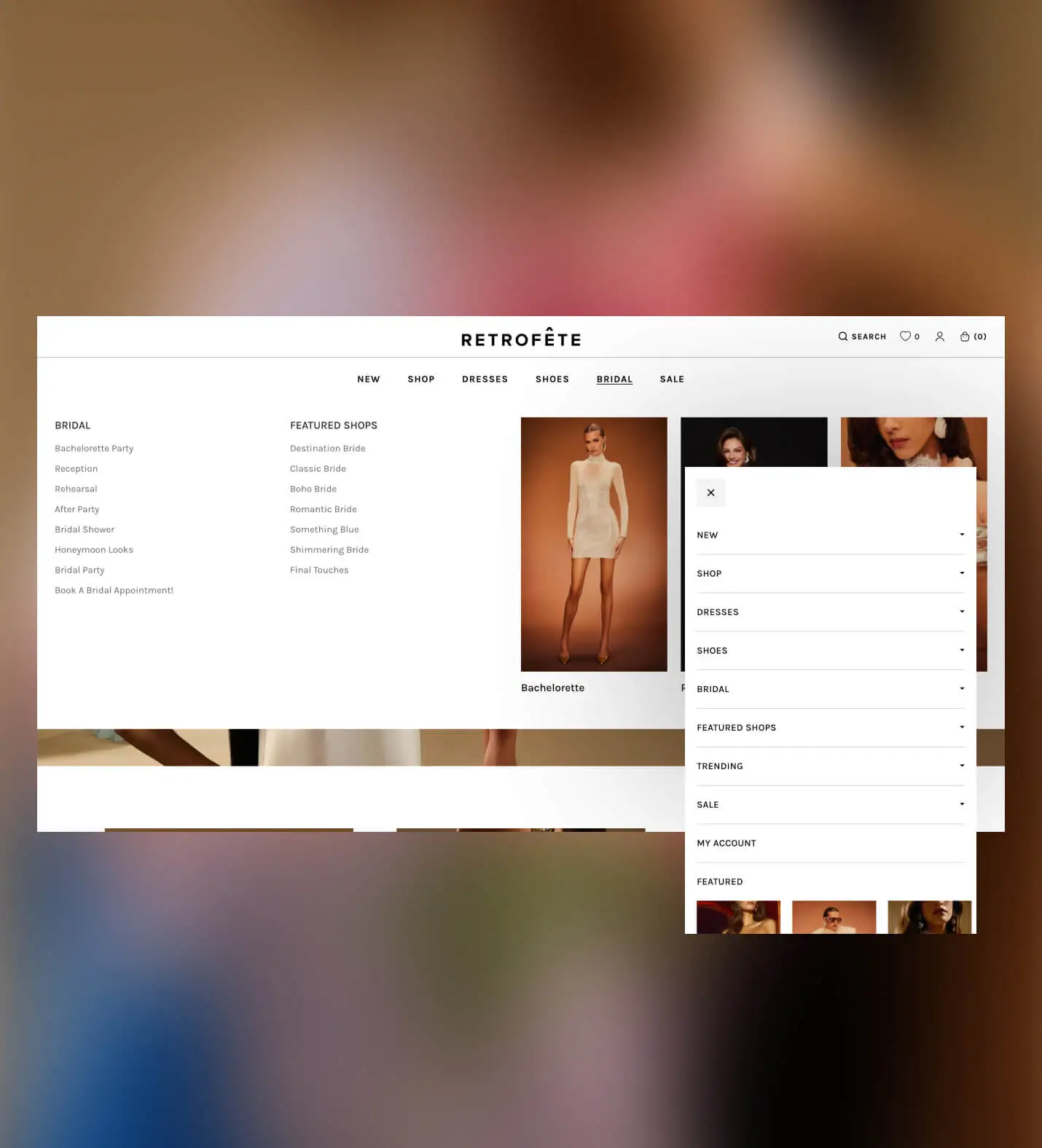
Made navigation intuitive and visual, not just minimal.
The goal wasn't fewer options—it was navigation that guides people. I redesigned the primary nav to be more intuitive and more visual, so shoppers could recognize where to go, explore confidently, and move into the right category with less effort, especially on mobile.
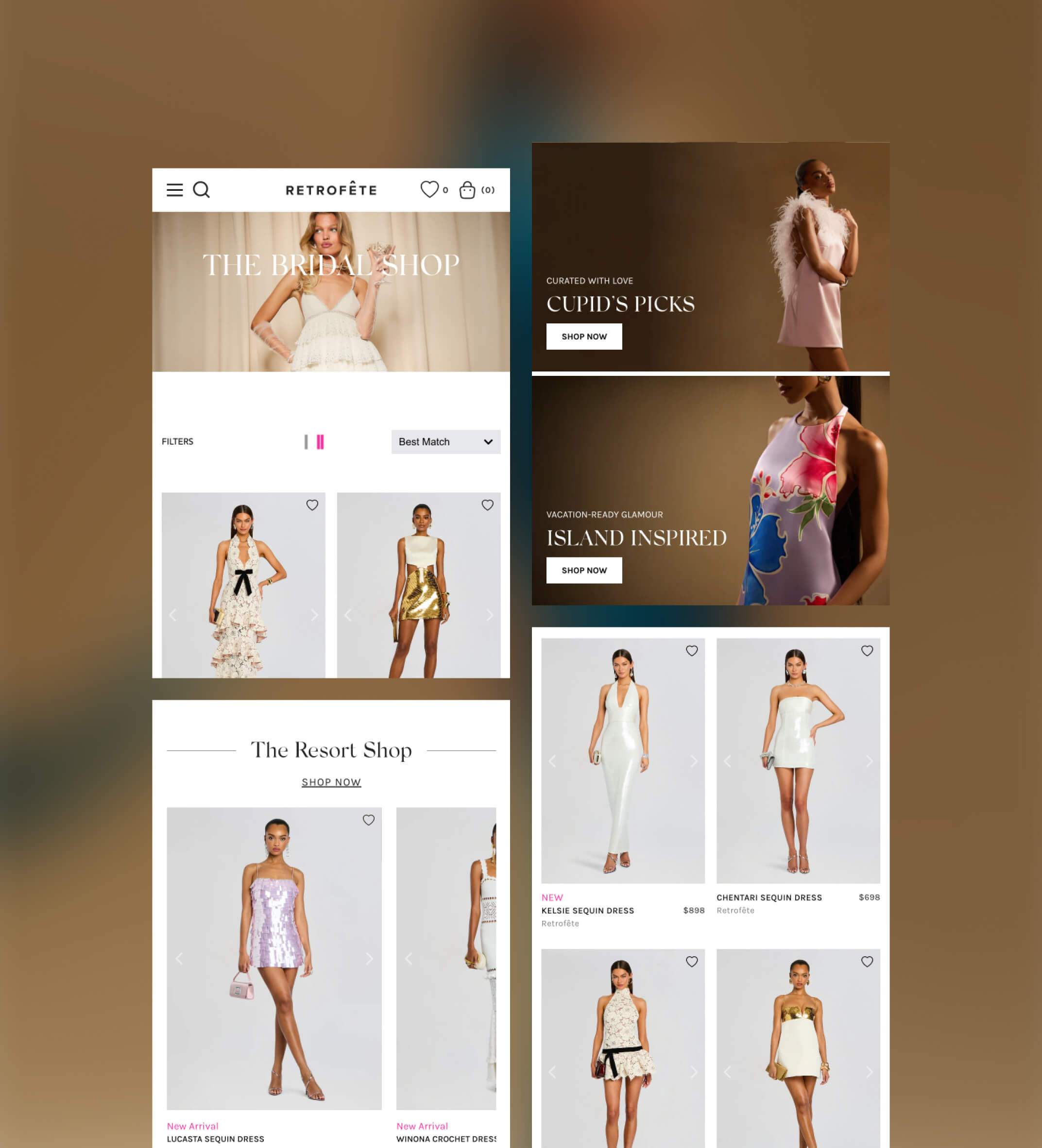
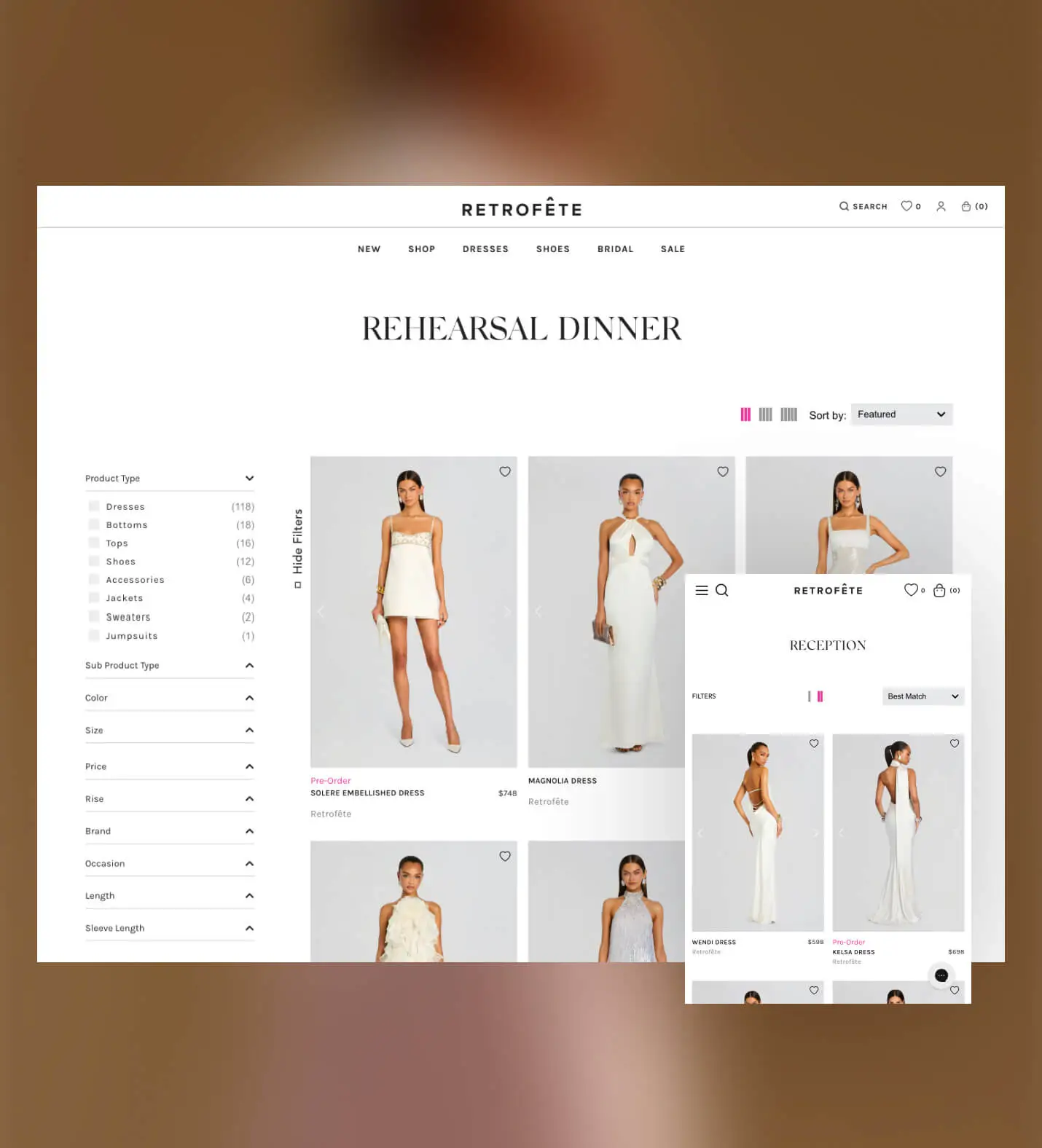
Improved discovery without overwhelming shoppers.
Retrofète's collection pages are where browsers become buyers. I redesigned the grid layout and filtering experience to make scanning faster and narrowing easier. With the improvements, shoppers could get to the right product with less effort. The focus was on reducing cognitive load: cleaner product cards, more intuitive sort and filter options, and a layout that lets the photography lead.
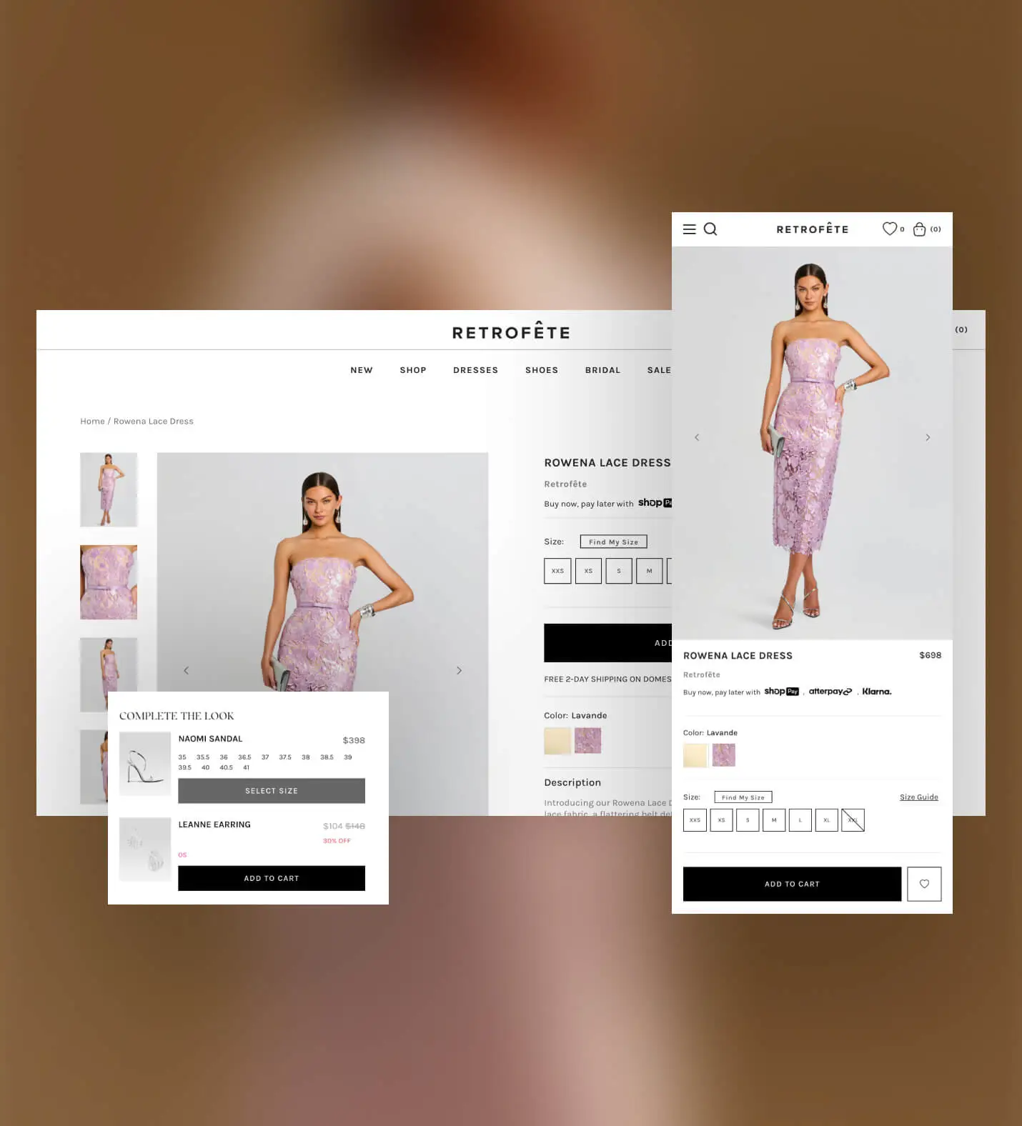
Simplified product pages to make decisions easier.
On the PDP, the goal was confidence. I kept the layout clean so the product stayed front and center, and made key decision support easier to access—especially around sizing. We also added a straightforward upsell that helps complete a look without distracting from the main purchase.